Project Showcase
Highlight of my featured works
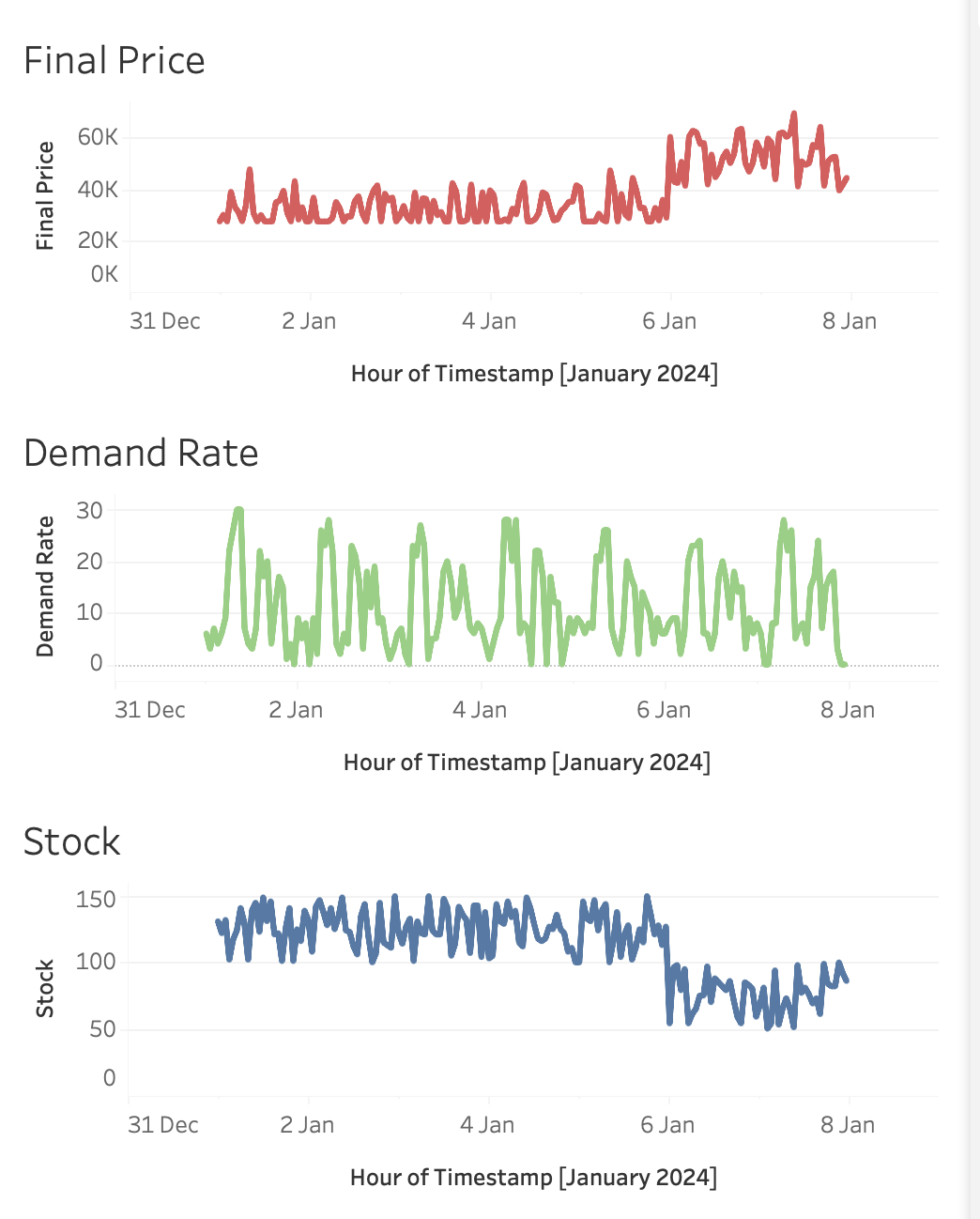
Final Price Dashboard
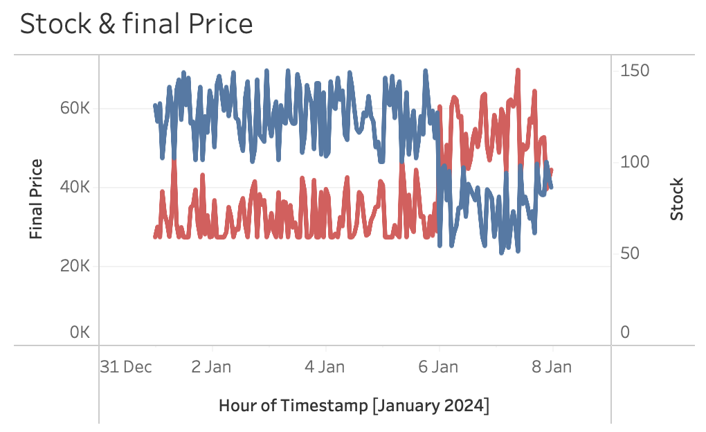
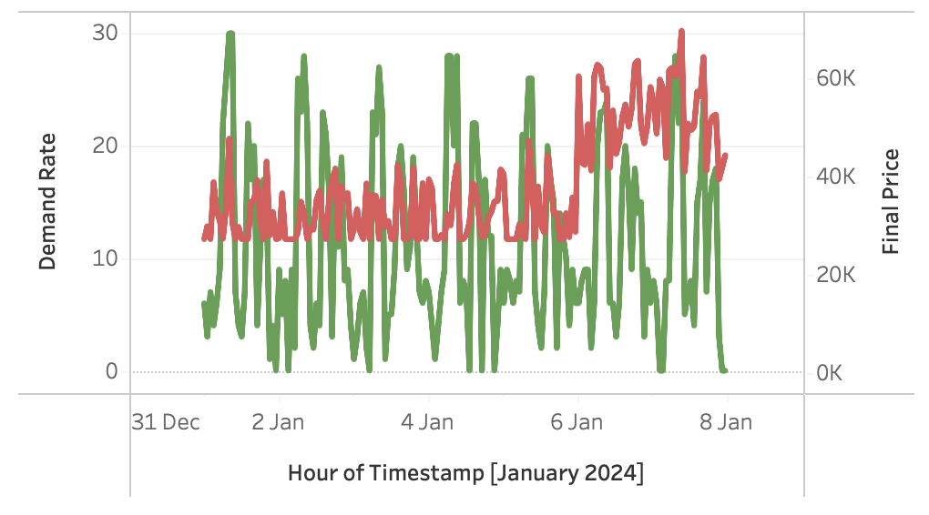
An interactive Tableau dashboard visualizing hourly correlations between Final Price, Demand Rate, and Stock. Highlights key pricing dynamics in short-term market behavior.
🎯 What I Learned
- Built Tableau dashboards with multiple time-series charts
- Identified positive correlation between demand and price
- Observed negative correlation between stock and price
🛠 Tech Stack
- Tableau Desktop / Tableau Public
- Excel / CSV Data Source
📌 Evaluation
The dashboard shows strong correlations: demand positively affects final price, while stock has an inverse effect. This validates pricing dynamics where scarcity drives up prices. Profit margin, competitor price, and capital were excluded due to their monthly rather than hourly variation. Overall, the dashboard effectively highlights the short-term drivers of price changes.