Project Showcase
Highlight of my featured works
Obesity Data Models & Visualization
A data visualization project using R and ggplot2 to explore obesity datasets. Includes dashboards of distributions, correlations, and group comparisons.
🎯 What I Learned
- Created clean and interpretable plots in R
- Visualized correlations and distributions
- Designed dashboards with ggplot2 + patchwork
🛠 Tech Stack
- R, ggplot2, dplyr, tidyr
- gridExtra, patchwork
- ggthemes
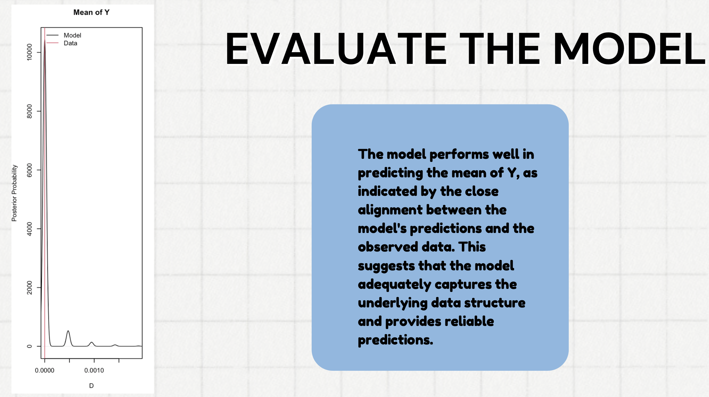
📌 Evaluation / Next Step
The visualizations provided strong insights into obesity patterns across demographics and lifestyle factors. While static plots convey clear insights, interactive dashboards (Shiny, Plotly for R) would allow deeper exploration and filtering by user groups.